Blue Shield of California
Redesigning the Pharmacy Claims Experience
Senior UX/UI Designer
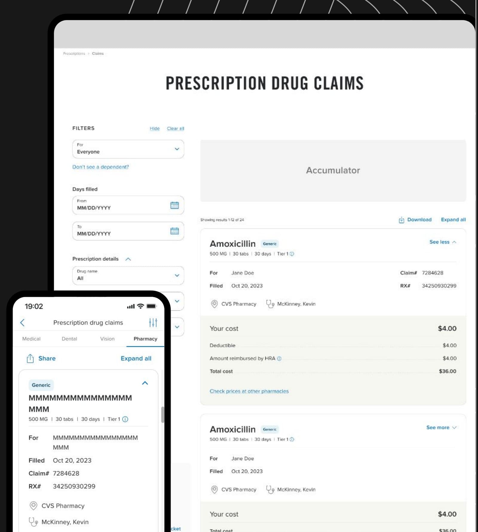
Members could access their prescription claims, but not always make sense of them. I redesigned the experience around a two-toned card and filter Drawer, lifting satisfaction 15 points to 94%.
- Healthcare
- UX Research
- Usability Testing
Problem
Claim Detail generated the highest call volume across the entire Claims section in 2023 — even as member sentiment trended positively — signaling that members could access their claims but not always understand them.
- What medication did I receive?
- How much did I pay?
- How much did my health plan cover?
- Did this claim count toward my deductible or out-of-pocket maximum?
- Where and when was the prescription filled?
- Can I see prescription claims for someone else on my plan?
How might we help members find and understand their prescription claim information independently — while adding more data without increasing cognitive load?
90%
Struggled to find claims details
82%
Ran into navigation difficulties
73%
Found the existing design outdated
65%
Wanted functionality that didn't exist yet
How I solved it
- 01
Reorganized the experience around member questions
Instead of starting from the existing interface or backend data model, I reframed the page around what members were actually trying to accomplish — “What happened with my prescription?”, “How much did I pay?”, “Can I see my dependent's claims?” — which shaped a two-column IA: Controls + Resources (filters, family selection, EOB, reimbursement) alongside Claims + Actions (accumulator info, download, claim cards).
- 02
Designed a new information hierarchy for data-heavy claims
Prescription claims carry a lot of necessary information, so removing detail wasn't an option. I split the claim card into two visual regions — a scannable primary summary and a secondary details area — paired with progressive disclosure: the first claim opens by default, the rest stay collapsed. A Consumer Rx Preferences survey (N=102) had shown refill counts, expiration dates, and total cost before insurance as “must haves” for 90%+ of respondents, and heatmap testing (N=99–100) confirmed cost fields drew the most attention — both of which shaped what the primary region surfaced. An A/B test of the redesigned card against production showed a clear lift in “meets my needs,” with the itemized cost breakdown named the most-liked change. Drug names were also moved out of ALL CAPS to improve readability.
- 03
The claim card became more than a Pharmacy Claims solution
Other product teams faced the same challenge — organizing large amounts of structured data without turning the experience into a spreadsheet. The two-toned card became a foundational design-system reference, with documented anatomy, primary/secondary hierarchy, expanded/collapsed states, content-density guidance, responsive behavior, and accessibility considerations.
- 04
Redesigned filtering around the member's mental model
Members usually arrived with a specific question — “How much did I spend on this medication?”, “Where is the claim from this pharmacy?” The redesigned filters let members narrow by drug name, pharmacy, prescriber, date range, family member, deductible, FSA eligibility, and HRA reimbursement, defaulting to the most recent claims so results were useful immediately. Heatmap testing had also shown filtering by prescriber name was rarely used, reinforcing where it belonged in the field order.
- 05
Usability testing changed the design
Testing showed members didn't think of Drug Name, Pharmacy, and Prescriber as “Pharmacy Details” — and expected Drug Name to be the most prominent filter. We renamed the group to “Prescription Details” and reordered the fields to Drug Name → Pharmacy → Prescriber. The same round of testing also caught a discoverability problem: heatmap data had shown 90% of first clicks missed the claim card's expand caret entirely, and usability testing confirmed only 10% of participants clicked it — the interface needed to reflect the member's mental model, not the organization's data model, in both its labels and its affordances.
- 06
Introduced a Drawer for complex filtering
As the responsive layout narrowed, keeping a full filter panel visible would compete with the claims themselves. I introduced one of the product ecosystem's first Drawer patterns, establishing rules for opening/closing behavior, Apply and Clear All, persistent selections, focus management, keyboard interaction, responsive behavior, and accessibility — rules that later became a reference for adapting the Drawer across other Lines of Business.
- 07
Designed responsive web with future mobile adoption in mind
The immediate scope was responsive web, not native mobile — but I designed the underlying patterns so they wouldn't become throw-away work later: how claim cards could translate to smaller screens, how expand/collapse could work with touch, how filters could transition into a Drawer, and how information priority should shift as screen space decreased.
A closer look
AmoxicillinGeneric
500 mg · 30 tabs · 30 days · Tier 1 · Generic
For
Jane Doe
Pharmacy
CVS Pharmacy
Prescriber
McKinney, Kevin
What testing changed
- 01
The caret wasn't discoverable enough
93% of participants said the expanded claim card met their needs well or very well — but only 10% actually clicked the caret to open it. The content worked once found; the affordance needed to be stronger.
- 02
Designing the no-claims experience
A blank page could read as a bug rather than a fact. Instead, subscribers with no personal claims saw eligible family members' claims automatically (where permitted), and members with none saw accumulator info plus a clear path to submit a claim.
Impact
94%
Said the redesigned page met their needs well or very well
+15pts
Percentage-point improvement over the existing experience
93%
Said the new claims card met their needs well or very well
What members said
“Very easy to read and understand this display. I like that it gives you all the information in one place.”
“It's complete and uncluttered.”
“I like how much information is displayed and can be filtered to make searching easier.”
Business impact
The redesign targeted the area generating the highest call volume within Claims in 2023. By improving information hierarchy, filtering, and access to additional claim details, the new experience built a stronger self-service foundation aimed at reducing avoidable member inquiries, and established an architecture that could support additional prescription and financial data as those sources became available. Over time, the team also observed a significant drop in Claim Detail call volume — the operational signal that motivated the redesign in the first place.
Design-system impact
Two-toned cards
Became a foundational pattern for organizing complex, data-heavy information across other experiences, with documented anatomy, variations, and usage rules other teams could build from.
Filter Drawer
One of the first examples of the Drawer interaction in the ecosystem, and the reference point other Lines of Business used to adapt the pattern to their own experiences.
Documentation
The interaction rules, variants, and accessibility guidance produced through this project turned two one-off solutions into reusable building blocks for future product teams.
What this taught me
Healthcare members don't necessarily need less information — they need the right hierarchy, context, and controls to understand it. The strongest outcome wasn't just a better Pharmacy Claims page — it was creating patterns that made the next product problem easier to solve.